Showing posts with label pet. Show all posts

Wednesday, November 26, 2014

Shiner - value study

I painted this one almost entirely upside down except for the final touches. I started with only 5 values (1, 3, 5, 7 and 9, 9 being the lightest) (I should have taken a picture at this point :(
The background (reflection in the window) was competing too much with the subject itself (the cat) .  So I changed the the background using the values 8, 7 and 6. (No picture of that step either.) Then  the foreground: the bed (or what looks like a chair) and the cat were too much the same and too dark. So to separate the two I decreased the bed value to the lowest (value 1 and) and used values 3, 4 and 5 for the cat shadow and values 5, 8, 9 on his light side.

Anyway that may be too much information... I could have played with this one a lot longer, but I'm happy with it.

Shiner - value study

Tuesday, November 25, 2014

"Petit Kahsmir", 5-value study

I did most of this painting upside down. It helps to stay focused on the shape themselves instead of what I'm painting (like an eye, a ear, ...) Then I turned the painting around for the final touches. I 'm very happy with his facial expression. That looks like him.

Oh, oh I forgot to paint whiskers...

"Petit Kashmir", 5-value study

Sunday, November 23, 2014

Tuesday, March 11, 2014

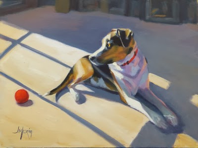
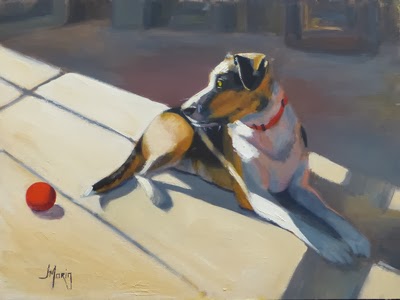
Our dog Maple, twice

Here are two paintings of our dog Maple. I thought the front legs were too short and the colors too subdued in the first painting (Maple III at the bottom) so I did second one (Maple IV at the top). I had a bit more perspective on Maple's body (the butt is smaller and recedes more), but now I don't notice much difference in her front legs, hmm... So I ended up with two (very) similar paintings because whatever I like in one painting, I tried to reproduced in the other one...

The question now is: which one is better? Ken prefers the first one (Maple III) because Maple stands out more and the overall colors. I prefer the second one (Maple IV) for her facial expression and the colors. Do you have a preference or is there not enough difference between the two paintings to make a choice?

Maple IV, Oil, 12 x 16"
Maple III, Oil, 12 x 16"

Thursday, February 20, 2014

Becky - my sister's dog

My sister Diane's favorite colors are blue and orange. So I used those colors as much as possible to paint her dog, a Yorkshire named Becky. I wanted the painting to be loose and show some energy with the brushstrokes. I think I did it to some degree but I neglected the likeness of the dog. You can see "Becky - first attempt" compared to the reference picture at the bottom.

So I tried it again, with a different palette this time. I used only chromatic black, burnt sienna, yellow ocher and white. I paid more attention to the likeness ("Becky - second attempt"). ...and I added extra hair on the back of the head... Oh well! :-)

So we (Ken and I) were very "anxious" of Diane and her boyfriend Michel's reaction when we gave it to them. We thought they may not want it. They haven't shown  interest in my paintings and Michel has been collecting paintings in a completely different style than mine.

They LOVED it! Phew! And we think we saw a tear in Diane's eye...

Becky - second attempt, Oil, 6 x 8"
Becky - first attempt, Oil, 8 x 10


Becky - reference picture